


Today, I did a thing. I recreated one of the default Captivate QSP’s (Quick Start Projects) – the first ten or so slides at any rate, in a rescaled variation. I wanted to share this because I usually want my projects to export from Captivate, to Captivate Prime. I usually want my projects to be fully responsive, and that includes the ability to make those projects go all the way from full screen on a typical 1920 x 1080 view in browser, down to a mobile phone.
By default however, Captivate responsive projects are size capped at 1024 x 627. Now for you, that might be fine, and you might be sure that your users are not viewing content on larger displays, but for me – I’m pretty sure that those who view my projects will see them at the larger size. Before I get into the details, I’ll share that I might have been more reticent to increase the default size of a Captivate project, if I were planning to do screen capture. Increasing the project scale by this much could lead to a massive increase in the size of the resulting project – especially if that project contained heavy full screen video or application capture animation.
But if you do want your responsive project to grow to fill a screen that’s much bigger than 1024 x 627, I thought I’d share the steps required to make it so, even if you wanted to do it with a Quick Start project. This is a fairly simple task, rescaling a Captivate project requires just one command, however – because the project is responsive, there will usually be several additional tasks required in order to ensure that your project continues to behave nicely while it changes size and adjusts to fit other views and orientations.
I began the process in Captivate 2019, latest update. I created a new, blank, responsive project. Captivate happily creates a project for you, but … the max size is shown at the top of the window – and it isn’t the size that you wanted. You might be tempted to try to adjust the max display size using the fields at the top of the stage, but that won’t do it. You’ll need to use the Modify Scale command. From the top menu, select Modify: Rescale Project. This will then show you a simple dialog, where you can enter the appropriate maximum size. (1920 x 1080)
Do not select Maintain Aspect Ratio. Once you have typed in the new size, then press the ‘Finish’ button. Aaaaannnnnddd… nothing will appear to have happened. 
Oddly, what will really happen is your project size display will now read 1024 x 1080. Just ignore it, your project is bigger than that, but it is ‘displaying’ only this portion of the project. We will be a bit more insistent. Type 1920 into the stage width parameter at top of screen, and then type 1080 in the height parameter at the top of the screen. If you want to make this setting available in future, also click the plus button to the right of the stage size options, and it will let you name this mega view.
Now you have a project that is set to full size, and you have a display view setup to view the entire project at that full size. Maybe. It is possible, likely even, that in Captivate you do not by default have the application environment setup to link the actual height of slides to the preview height of slides. If that is the case you will see a broken link icon in the properties panel of the stage property inspector next to the preview height property. To fix this, just select the icon / button and now the stage height will match the preview height. (1080)
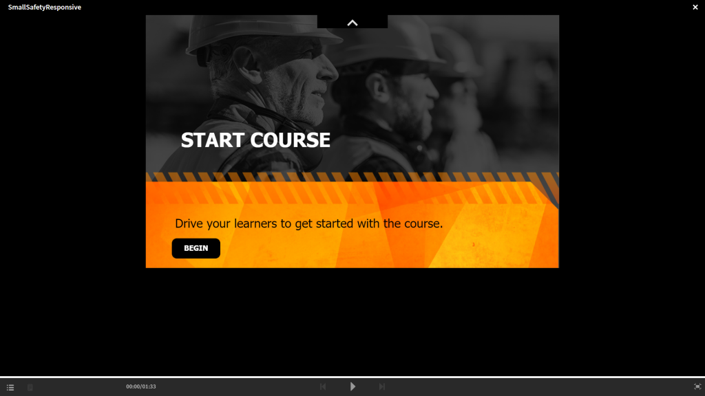
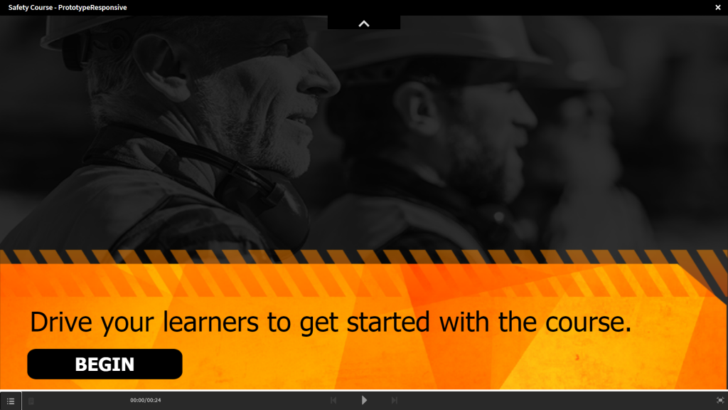
But what about those tasty templates? What happens if you import a quick start template into this mega size template? Depending on which slide(s) you import, you might not immediately see the difference. This is because background images in Quick Start templates, usually take advantage of the ’tile’ option, to change the size / location of the background image as the slide changes size and orientation responsively. However, that also means that most backgrou.nd images will be too small to perform as expected. The best fix for this is to simply resize the background image in order to ensure that it is large enough to fit the expanded size of the larger default slide. If the new image is upsized, then you will find that it fills the space, even without changing the fill option from image: tile, to image:scale.
So what’s the difference between image fill: tile, and image fill: scale. As the name suggests, scaling an image fill area will cause the image to stretch to fill the width and height of its container. This can be a big problem in responsive projects because the container can totally change from tall to skinny etc, and it will badly distort photographic images. Tiled images can be locked to the center, or to one side / corner, and the pattern will simply repeat if the image is too large. Perhaps more importantly for responsive projects, tiled images will kind of auto-crop themselves, based on their alignment – so if the ‘figure’ is on the right, you lock the image to the right, and when scaled horizontally, the figure will simply trim the left side as space diminishes. This is how I was able to adjust the templates. I simply enlarged the background images (usually assigned to the fluid box backgrounds) and made no other substantial changes to backgrounds and images. I also increased the font sizes of the major text elements, in order to ensure that it looked right at even the larger size.
I suspect that adjusting things like quiz questions will incur a steeper penalty – take a lot longer to tweak, but this could provide you with a simple startup guide to begin the process, so I thought I’d share my experience. I’d love to hear your process – and more thoughts from you about handling this sort of thing. I spoke with Dr. Pooja Jaising about this and she mentioned that you can easily handle this by using non-responsive projects, and ticking the box to enable HTML5 scaling – though of course you would lose the responsive behavior for tablets and phones.
Let me know your ideas and strategies in the comments. I’ve included the sample I made Safety Course Mega Size – CPTX source, for your convenience.
The post Making Responsive Projects in Captivate, that fit Prime perfectly. appeared first on eLearning.
Today, I did a thing. I recreated one of the default Captivate QSP’s (Quick Start Projects) – the first ten or so slides at any rate, in a rescaled variation. I wanted to share this because I usually want my projects to export from Captivate, to Captivate Prime. I usually want my projects to be fully responsive, and that includes the ability to make those projects go all the way from full screen on a typical 1920 x 1080 view
The post Making Responsive Projects in Captivate, that fit Prime perfectly. appeared first on eLearning.Read MoreAdobe Captivate, Captivate Prime, Captivate Prime LMS, Sample Project Preview, Uncategorized